Orlando Magic Unveil New Logo: The Star Shines Once Again
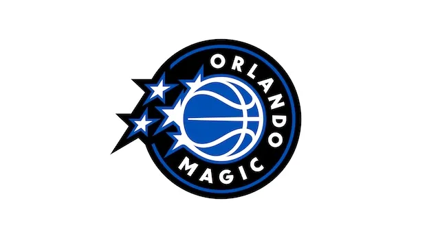
On a vibrant afternoon in Orlando, the Orlando Magic made headlines by unveiling a striking new logo that proudly embraces the team’s legacy while foreshadowing a promising future. The centerpiece of this redesign is ‘The Star’, a symbol that has repeatedly resonated with the franchise’s identity since its inception in 1989. Also introduced were completely revamped jerseys and branding that thrillingly harken back to the iconic ’90s aesthetic, a nod to a period when the Magic captured the hearts of fans and left an indelible mark on the NBA.
A Rich Legacy
Since entering the league, the Orlando Magic has experienced a rollercoaster of triumphs and trials. With superstars like Shaquille O’Neal and Penny Hardaway leading the charge in the ’90s, the franchise saw success both on and off the court. The new logo and updated branding are not just changes in design; they are a celebration of a storied history that the organization aims to honor while bringing enthusiasm to both new and long-standing fans.
The Star: A Time-Honored Emblem
The return of ‘The Star’ as the main logo is crucial as it represents the heart and spirit of Orlando. The emblem has been a long-standing symbol of hope, aspiration, and stellar performance in basketball. By bringing back this iconic motif, the Magic is subtly signaling a recommitment to their standards of excellence and championship aspirations.
New Jerseys That Captivate and Inspire
Becoming an instant fan-favorite, the new jerseys combine the modern touch with classic charisma. Paying homage to the ’90s, the designs incorporate the same color palette — a striking combination of blue, black, and white, evoking nostalgia while ensuring relevance in today’s NBA landscape. Features include bold digit designs that harken back to the jersey styles worn during the franchise’s earlier glory days, providing a perfect intersection between past and present.
Modernizing the Brand
While the nostalgic aspect is vital, the Orlando Magic’s branding update thinks ahead. The new logo and jerseys also embrace forward-thinking design principles, allowing for typeface and graphic enhancements that resonate with the younger generation of fans. “We wanted to develop a design that is both deeply rooted in our past and reflective of the innovations that are driving basketball into the future,” said the team’s lead designer during the press conference.
Fan Engagement and Reaction
The unveiling event hosted a sea of ecstatic fans, all eager to catch a glimpse of the new look. Many expressed nostalgia, recalling fond memories of watching the team during its peak in the ‘90s. “I remember the excitement when the Magic swept through the playoffs; I can’t wait to see them back in these colors,” said a fan present at the event wearing a vintage jersey. The enthusiasm among supporters demonstrates the emotional connection many have formed with the team, further reinforcing the relevance of the redesign.
Community Impact
The Orlando Magic’s fresh look goes beyond just aesthetics; it has meaningful implications for community engagement. A portion of merchandise sales from the new jerseys will fund local youth programs, basketball camps, and educational initiatives in the Orlando area. “As we revitalize our brand, we also want to invest in our community and ensure that young people have opportunities to interact with the game and develop their skills,” said the team owner. This initiative has inspired hope and optimism within the community, showcasing how sports can positively influence societal developments.
The Magic’s Strategic Vision
With the new branding, the Orlando Magic have a clear, strategic vision of building a competitive team that can perform remarkably in the league. Managing Director and General Manager Jonathan Isaac shared insights on the organizational strategy during the unveiling, stating, “This is just the beginning. We’re committed to creating a team that not only performs well but also embodies the spirit and values that the Magic brand represents.” The excitement surrounding the team during the offseason suggests that fans have reason to believe in the potential for a bright future.
Looking Ahead
As the franchise embarks on this new chapter, enthusiasm builds not only among local fans but across the league. Expectations are mounting for the upcoming season, and players are eager to don the elegant new uniforms, evoking rich memories while inspiring new legacies. As training camps open and the NBA season approaches, the hopes for success are palpable within the organization and its extensive fan base.
Conclusion
The Orlando Magic’s decision to roll out a fresh logo and nostalgic jerseys represents a charming synthesis of past achievements and future aspirations. Fans will have the chance to don these new designs while rallying behind their team. This rebranding effort can serve as a phenomenal opportunity for the franchise to reconnect with its supporters, instill pride amongst players, and underscore its commitment to the community. With the new ’90s-inspired look ready to take the court, the Magic seem poised to ignite that unmistakable flame of excitement once again in Orlando.

